
Page design basics for school publications
Readers decide where to look in the first second they spend with a page, and design makes that choice for them. Grids, type, one strong photo and some breathing room do most of the work in print and online.
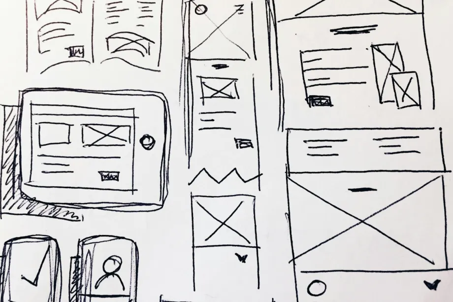
Open any issue of a school paper and your eye lands somewhere before you have read a word. Good design decides where that is. It does not decorate the reporting. It tells the reader what matters most on the page, what comes next and where one story ends and another begins.
Start with a grid
A grid is a set of invisible columns and rows that every element on the page snaps to. Headlines, text, photos and captions all line up with the same lines, which is why a well-built page looks calm even when it is full. Without a grid, elements land wherever there happens to be room and the page starts to look accidental.
Newspapers commonly use a handful of columns across the page. More columns give you more options: body text can run across two narrow columns, a sidebar can take one, and a big headline can stretch across the whole width. Yearbooks often use a modular grid, dividing the spread into a set of equal boxes that photos, captions and copy can occupy in different combinations.
Whatever grid you choose, use it. Line photo edges up with column edges instead of letting them stop partway across. A useful check is that every element should align with at least one other element on the spread. When things share edges, the page reads as a single design rather than a collection of pieces.
Make the type do the ranking
Type hierarchy tells readers what to read first. The main headline is the biggest and heaviest type on the page. Below it, a deck (a short secondary headline) adds context in a smaller size. Body copy is smaller still, and captions are set apart so nobody mistakes them for story text.
For body copy, pick a plain, readable face and leave enough space between lines that the text does not look crowded. Serif faces are a common choice for long passages in print, while sans-serif faces often handle headlines, captions and screen text. The specific families matter less than using them consistently.
Long stories need entry points. Subheads every few paragraphs let a skimming reader find their way back in. A pull quote, set larger and pulled from the story, gives a hint of what the piece is about and breaks up gray columns. Captions can use italic or a contrasting face so they stand apart from the body text.
Choose one dominant photo
Every page needs a clear focal point, and that is usually a photograph. Pick the strongest image for the story and run it noticeably larger than anything else on the page. When several photos are about the same size, none of them wins and the reader has no obvious place to start.
Placement matters too. The dominant photo often works best near the top of the page, where readers tend to look first. Pay attention to which way the action faces. If a runner in the frame is moving left, put the photo where she runs into the page instead of off its edge. Subjects that face out of the layout pull the reader's eye with them.
Keep every caption right next to its photo. A caption should identify the people shown, explain what is happening and add something the picture cannot say on its own.
Leave room to breathe
White space is any area without text or images. It is not wasted. It separates one story package from another and gives the eye a rest.
Keep margins consistent around the outer edge so type never crowds the trim. Keep gutters between columns consistent so lines of text do not seem to run into each other. Your printer can tell you how much safe margin it needs near the trim.
Watch for trapped white space, a random gap boxed in by text and photos in the middle of the page. It looks like a mistake because it usually is one. Push extra space toward the outside of the layout, where it frames the content instead of puncturing it.
Write it down in a style sheet
A style sheet records the visual rules of your publication so that every designer, this year and next, makes the same choices. Without one, each page drifts toward its designer's taste and the issue looks like a set of strangers' work.
A useful style sheet lists the type families for headlines, body copy and captions, along with the sizes and line spacing for each level. It notes the standard column setup and gutter width, the color palette with values for print and for screen, and rules for borders, dividers and background tints. New staff can read it in a few minutes and design pages that already fit.
Consistency is part of credibility. When headlines, captions and margins look the same from page to page, readers trust the publication more, even if they could not say why.
Print pages and web pages
Print and web share the same principles of hierarchy and alignment, but they behave differently. A printed page has a fixed size. You control exactly where everything sits, and two facing pages work together as one spread.
A web page has no fixed width. The same story might be read on a wide monitor or a narrow phone, so layouts need to rearrange themselves, with columns stacking on small screens. Photos may need different crops: a wide horizontal image that works as a desktop banner can feel tiny on a phone, where a vertical or square crop often reads better.
Images are prepared differently as well. Print files need enough resolution for sharp reproduction, and your printer will specify what it expects. Web images should be smaller files so pages load quickly. On the web, links, related-story boxes and clear navigation take over the job that section headers and page turns do in print.
One rule does not change between formats. Design must never distort the news. A crop should not remove context that changes what a photo shows, and graphics should never hide or contradict the facts in the story. Clear design serves the reporting.
Frequently asked questions
How many fonts should a student publication use on one page?
Most designers stick to two type families, one for headlines and one for body copy, and get variety from size, weight and italics within them. Every extra typeface makes the page look less organized.
What is the difference between CMYK and RGB color?
CMYK describes color made from cyan, magenta, yellow and black inks, which is how printing presses work. RGB describes color made from red, green and blue light, which is how screens work. Files headed to a printer are usually prepared in CMYK, and your printer can tell you exactly what it needs.
Why does a page need a dominant photo?
A single photo that is clearly larger than the rest gives the eye a place to start. When several images are roughly the same size, they compete and the page feels flat.
How is a gutter different from a margin?
Margins are the empty space around the outside edge of the page. Gutters are the narrow spaces between columns of type. Both keep copy from looking cramped.